TablePress: how to make images responsive
Tablepress is a great tool for building tables in Wordpress. However, using the TablePress tool for adding images does not yield responsive images that resize for the small screens on mobile devices. The resulting page does not pass Google's "mobile-friendly" test.
With the help of https://ncoughlin.com/tablepress-responsive-images/ and WFU Instructional Technology Analyst Ching-Wan Yip, I developed the following procedure for adding images to TablePress tables.
- Create your TablePress table as usual.
- Create a separate new page (or erase the contents of an old page) that will act as a staging area for your images.
- On the new page with the Visual tab selected, click the "Add Media" button. This opens the add media dialog. Either select an existing image from your Media Library or click "Upload Files" and add the file you want.
- Using the form at the right side of the Insert Media window, add any metadata and/or link you wish.
- Click "Insert into page" which returns you to the staging page you created in step 2.
- Click on the "Text" tab and copy all the displayed HTML for the image.
- Switch to the TablePress editing window and paste the HTML.
- Click "Plug-in Options" under TablePress and enter the following in the "Custom CSS" text box:
.tablepress-id-N img {
 max-width: 100%;
 height: auto;
 }
where N is the table number of the table you are working on.
The last step need only be done once for each table.
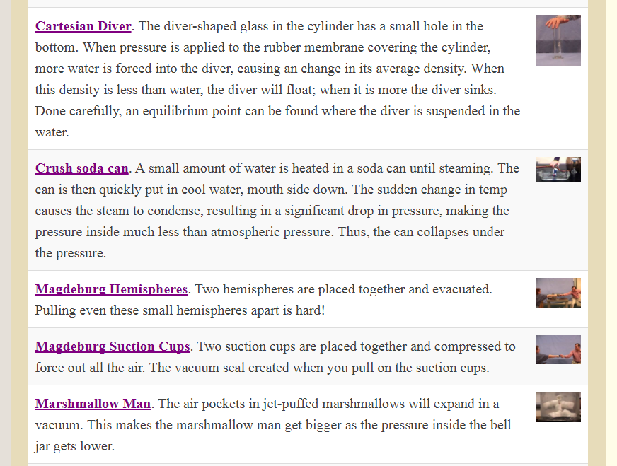
A common use case is text in column 1 and images in column 2. In this case, you may find that the images are resized much smaller than you want. Here is an example:

One remedy is to also inclulde the following in step 8:
.tablepress-id-N .column-2
 {
	width: 30%;
}
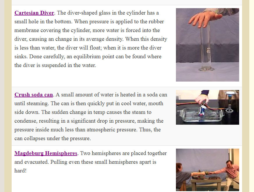
Once again, "N" is the ID number of the table you wish to control. Here "column-2" is the column containing my images. You may adjust the "30%" above to whatever fraction of the table width you wish to set for your image column. Here is the same region of the web page after including the above CSS:

One importan caveat: the above will not enable resizing on images in the first column. There must be CSS somewhere in TablePress that is overriding the responsive CSS. If anyone knows of a way to correct this, please contact me at matthews@wfu.edu.
An organizational tip: If your website will have lots of images, you need to worry about organization. My approach: For the image staging page I describein step 2 above, I have a different staging page for each major category of images. Then I can use the "Uploaded to this page" filter in the "Add Media" page to narrow down my choices.